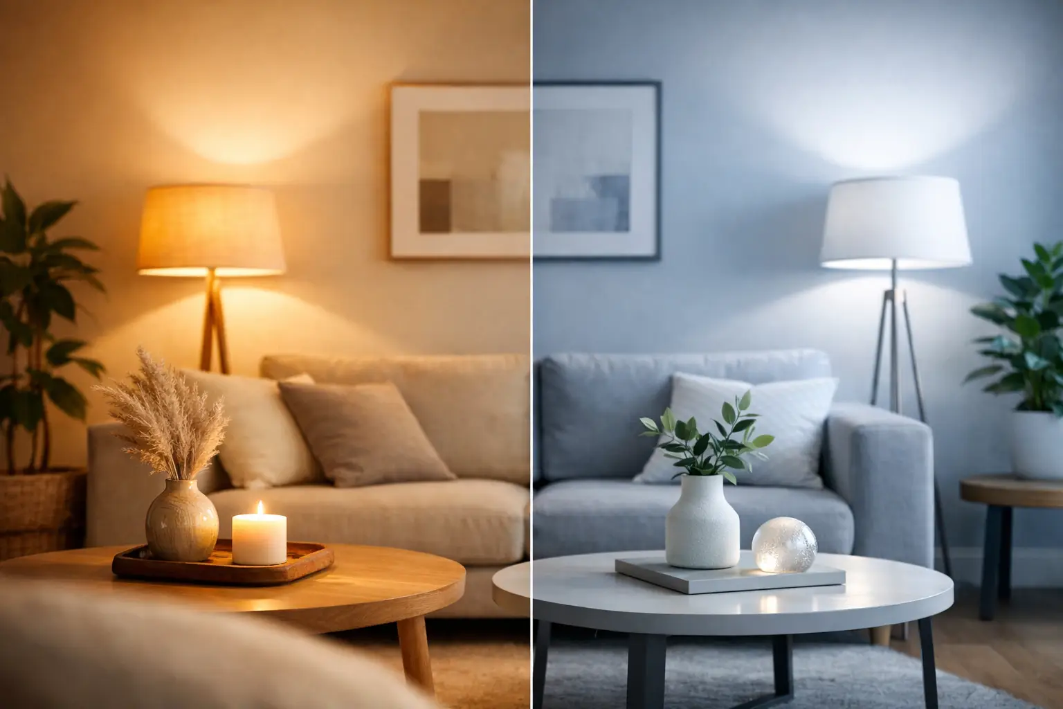
A brass pendant can look beautifully considered above a dining table, then feel strangely flat when fitted with the wrong bulb. That is why the warm white vs cool white decision deserves more attention than it usually gets. The colour temperature of your lighting changes how paint, timber, tiles, food, fabrics and even skin tones appear – as well as how a room feels when you walk into it.
For most homes, the best scheme is not one colour of light used everywhere. It is a deliberate balance: softer light where you rest and entertain, clearer light where you prepare food, get ready, work or need to see detail. Once you understand the difference, choosing bulbs, fittings, LED tape and smart lighting becomes far more straightforward.
Warm white vs cool white: the essential difference
White light is measured in Kelvin, shown as K on bulb packaging. It may sound technical, but the scale is simple: the lower the number, the warmer and more golden the light; the higher the number, the cooler and crisper it appears.
Warm white usually sits around 2700K to 3000K. It has a gentle golden tone, similar to traditional incandescent lighting, and creates a relaxed, inviting atmosphere. It works particularly well with timber, warm neutrals, brass, bronze, natural stone and layered textiles.
Cool white generally falls between 4000K and 5000K. It is a cleaner, whiter light with a subtle blue-grey cast compared with warm white. It makes details easier to see and can give contemporary kitchens, utility spaces and work areas a fresh, focused feel.
You may also see daylight bulbs, normally 5000K to 6500K. These are brighter and bluer again. They have a place in specialist task environments, garages or commercial settings, but can feel harsh in a living room or bedroom after dark.
| Light colour | Typical Kelvin rating | Overall feel | Best suited to | |—|—:|—|—| | Warm white | 2700K-3000K | Soft, golden, welcoming | Living rooms, bedrooms, dining rooms | | Neutral white | 3500K-4000K | Balanced and clear | Kitchens, bathrooms, home offices | | Cool white | 4000K-5000K | Crisp, practical, energising | Utility rooms, task areas, commercial spaces | | Daylight | 5000K-6500K | Bright, blue-white, clinical | Workshops and specialist task lighting |
The Kelvin rating tells you the shade of white, not the brightness. Lumens measure brightness. A low-lumen cool-white lamp can still look crisp, while a high-lumen warm-white lamp can make a large room feel comfortably bright. Consider both before buying.
Where warm white works best
Warm white is the natural choice for spaces designed around comfort, connection and winding down. In a living room, it flatters upholstered furniture, softens shadows and makes layered lighting feel intentional. Use it in table lamps, floor lamps, wall lights and dimmable ceiling fittings to build a room that feels just as good for a quiet evening as it does when guests arrive.
Bedrooms benefit from the same approach. Warm white bedside lamps are easier on the eye late at night and help preserve a calm, cocooning atmosphere. If you have a dressing table or fitted wardrobe lighting, you may choose a more neutral white there for practical visibility, while keeping the main lighting warm.
Dining rooms are another strong match. At 2700K, a pendant above the table makes candlelight, glassware and food look more inviting. This is especially effective with statement fittings in smoked glass, rattan, aged metal or fabric, where the lamp itself is part of the visual story.
Warm white also excels in hallways, landings and alcoves. These are transition spaces rather than task zones, so a softer pool of light feels more welcoming. Concealed LED tape beneath shelves, along joinery or behind a television can add depth without making the room feel overly bright.
That said, warm white is not automatically right for every traditional interior. In a very dark kitchen with deep cabinetry, heavily tinted 2700K lighting can make surfaces look yellow and reduce clarity. Moving to 3000K often keeps the warmth while giving the space a cleaner finish.
When cool white is the better choice
Cool white earns its place where accuracy, visibility and a cleaner aesthetic matter. In a utility room, pantry, laundry area or garage, it makes sorting clothes, reading labels and spotting small details easier. It can also suit a contemporary home office, particularly where the room is used during the day and has plenty of natural light.
Kitchens require more judgement. A 4000K cool or neutral white works well beneath cabinets, over worktops and around food-preparation areas because it renders detail clearly. White quartz, chrome, polished concrete and pale gloss cabinetry can look especially sharp under this light.
However, fitting cool white throughout the entire kitchen can make an open-plan space feel detached from the adjoining dining or living area. A better solution is to layer temperatures by purpose. Keep practical task lighting around 4000K, then introduce 2700K or 3000K pendants above an island or dining table. The zones feel distinct, but the overall scheme remains welcoming.
Bathrooms are another case where it depends. Cool white around 4000K can be useful at the mirror for shaving, skincare and make-up, as it gives a more honest view of colour and detail. Yet a bathroom lit only with cool white downlights can feel stark, particularly in the evening. Pair a clear mirror light with warmer ambient lighting, or choose a balanced 3000K to 4000K fitting if you want one consistent tone.
For hospitality and commercial projects, cool white is often effective in back-of-house areas, offices, retail displays and work zones. Front-of-house spaces usually benefit from a warmer tone that supports atmosphere and encourages people to linger. The right answer should reflect the customer experience as much as the task being performed.
Match the light to your finishes, not just the room
Room-by-room rules are useful, but materials can change the decision. Warm white enhances oak, walnut, terracotta, cream paint, boucle, linen and brushed brass. It brings out texture and makes natural finishes feel richer.
Cool white works confidently with crisp white cabinetry, black metal, grey stone, glossy tiles and minimalist palettes. If your scheme is heavily blue-grey, it can stop the room looking muddy. But in a north-facing room already short on sunlight, cool white may amplify the coldness. Warm white is often the more forgiving choice there.
Pay attention to the bulb inside decorative glass too. Clear glass pendants reveal the lamp, so an exposed filament LED in warm white can look far more polished than a plain cool-white bulb. With opal shades, the difference is subtler, but the glow on surrounding walls and furniture still changes considerably.
Colour rendering also matters. Look for a high CRI, ideally 90 or above, in areas where colour accuracy matters, such as kitchens, bathrooms, wardrobes and retail displays. A high-CRI lamp helps paint, food, textiles and finishes appear more natural. Kelvin determines whether the light feels warm or cool; CRI determines how faithfully it shows colour.
Avoid mixing white tones by accident
A common lighting mistake is using 2700K lamps in one ceiling fitting, 4000K under the cabinets and an unknown bulb in a nearby floor lamp. The result can look unplanned, even when every fitting is attractive on its own.
You do not need identical Kelvin ratings in every corner, but each zone should have a clear purpose. Keep lamps that are visible together within a similar range. For example, use 2700K across a living room, 3000K in a dining-kitchen area, and 4000K only where dedicated task lighting is needed.
Dimmers make warm white particularly versatile. A bright setting supports reading, cleaning and hosting; a lower setting gives the same room a softer evening mood. If your household uses one space differently throughout the day, smart bulbs or tunable LED strips offer even more flexibility. You can choose clear white light for breakfast or homework, then shift towards a warmer tone as the evening begins.
Choosing bulbs and fittings with confidence
Before ordering, check the Kelvin rating rather than relying on descriptions such as “soft white” or “bright white”, which can vary between manufacturers. Check lumen output too, particularly for ceiling lighting in larger rooms. A beautiful pendant needs enough supporting light around it, whether that comes from downlights, wall lights or discreet LED tape.
For renovation projects, plan the lighting temperature before the electrician starts. It is much easier to create a considered scheme when cabinet lighting, mirror lighting, stair lights and feature pendants are designed together. Bespoke LED strip lighting is especially valuable here, as it can be cut, positioned and specified to suit joinery, coves, shelving and architectural details rather than forced into a standard solution.
If you are still torn between warm and cool white, start with how you want the room to feel at 8pm rather than how it looks empty at midday. The most successful lighting does more than brighten a space – it gives every room the right reason to be there.